
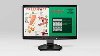
Longos - POS
(Point of sale)
screen
redesigns
Solo UI Project
Fall 2021

Project type
My role
Tools used
Duration
UI/UX Designer
Figma / Figjam
Photoshop
1.5 weeks
A solo project of
re-designing any web product, could be mobile or web based.

The Problem
Hierarchy of frequently used buttons need to be in place first for quick easy access for the employee (user).
Displaying easy access of buttons and headings within the sidebar (through flip-chart) creates faster transaction times. The ability to search for a specific PLU code through the flip-chart is lacking therefore there needs to be a better organization or having a visible search bar for easy lookup.
rESEARCH mETHODS (2)
-
Short User Interviews
-
Card Sorting
User Interview participants (3)
Questions as follows:
1. Is there anything you like or dislike about the appearance/functions of the Cash system?
2. Is there anything you would change?
3. What frustrates you?
“Its kind of annoying to flip through the function, tender menu to find specific things when they don't even seem to relate. I wish they could include a way
where - when an item doesn’t scan, we don’t have to go running to grab another one JUST TO scan the barcode
for the price. Also i don't get why we have two separate buttons for
debit and then Credit when they work the same? “

Julia A.
"The tax exempt and suspend buttons are weirdly coloured as it's not easy to find it when I'm looking. When we do redeem points for customers, the point balance is in this tiny box where our name is too… makes no sense “

Sam B.

Sophia G.
"The system is so slow and i hate how we have to flip through almost everything in the flip chart when we want to look for a specific code.
There’s so many boxes there that we don’t even use. Look of the cash screen is pretty old though, could look
better”.
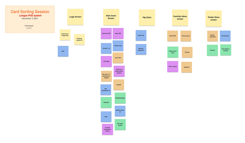
Card Sorting (done by julia a.)

The result
(*gathered from logo and current website)
Assets used
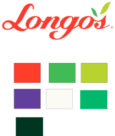
Swatches
Font Used (both on Longo's web and mobile)
Town 10 Display W05 Black

*Main design ideation
With the results of both card sorting and short user interviews, i stuck with the current design layout but instead use the same colour palette as Longos use for their current website.

Main changes
The flip chart was organized in a way where it would be easier for the cashier to find the PLU codes.
I also added a search bar for easier plu code search along with a side menu bar for easy access of different departments within Longos.
I also changed the hierarchy of the buttons on the main screens accordingly to how the card sorting result ended up.